I’m participating in a quick, five-day workshop on OER from Dec. 5-10 called Ed Tech Open, and one of the things for the first day (which I’m now two days behind on!) was to look over some resources on creative commons and create something about CC licenses that is itself CC licensed. I thought about making an image, a poster, something like that, but I just don’t have time in this lightning-speed workshop! So I decided to take a look at a few charts/infographics/posters and make a few comments about those. I was wondering what some of the effective ways might be to explain CC licenses visually.
I found the first one, below, from the OER workshop itself, and the others through various web searches. I’ll just saw a few things about how effective I think each one is. BUT, I recognize that such things are quite subjective; what makes sense, seems easy and clear, is going to differ amongst persons I expect.
The following chart, from CC Australia, gives a kind of decision tree for determining which license to use. Here’s the link to the source. This chart is licensed CC BY 2.5 Australia.
(function() { var scribd = document.createElement(“script”); scribd.type = “text/javascript”; scribd.async = true; scribd.src = “https://www.scribd.com/javascripts/embed_code/inject.js”; var s = document.getElementsByTagName(“script”)[0]; s.parentNode.insertBefore(scribd, s); })()
The questions on this poster are very helpful, I think–they’re simple and clear. The colours are what confuse me. The explanation on the left says that the pink boxes refer to remixing, the blue ones refer to commercial uses, and the purple boxes are the licenses. That makes sense, but then if you go that route then the first couple of boxes (the green “start” and the red “all rights reserved” boxes have to be different colours, of course. And the effect of all that just feels a bit confusing to me.
I do like the use of red for the “all rights reserved” box, though. It visually indicates that others can’t do things with your work w/o your permission, and it also subtly suggests that maybe one shouldn’t just jump to go that route–red can indicate, to me, a kind of warning, a danger.
One thing I’d like to see in flowcharts like this is some indication of the implications of one’s choices that one might not be aware of. Sure, I may think I don’t want anyone to change and adapt my content, but would I still think so if I knew that meant that people couldn’t even translate it into a different language, that I thereby make it such that my content will be unlikely to be used in many educational contexts, where adaptation to particular circumstances and learning needs is common?
The following poster (link to the original source) comes from Creative Commons Poland, and was designed by Piotrek Chuchla.
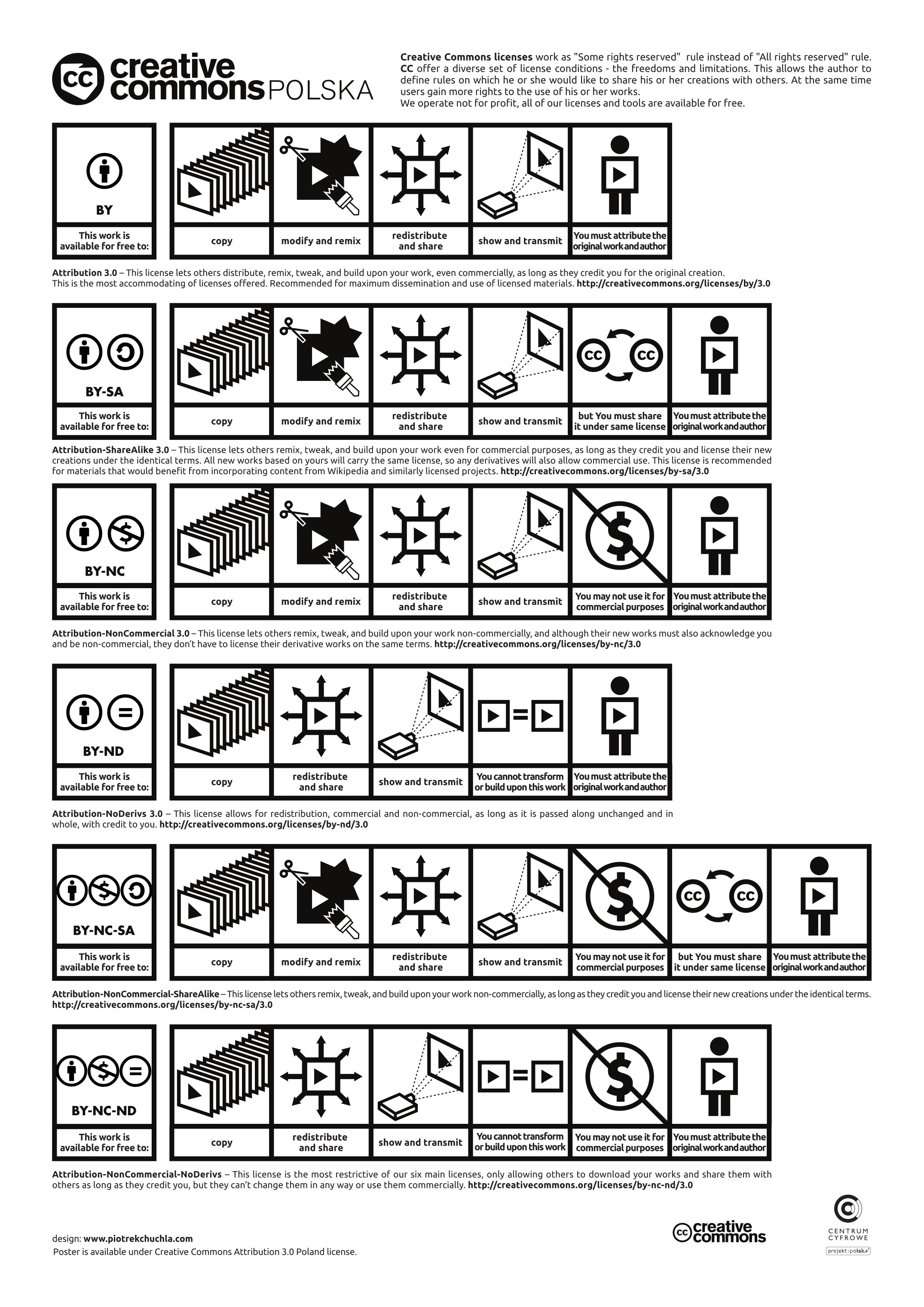
I think the strength of this poster lies in the fact that it emphasizes images over text. The text is there, of course, but it’s deemphasized. This might work for those who really gravitate towards images. But for me, it’s really no less confusing because I have to make sense of the images themselves. It’s like it’s adding a new visual “code” that I’m unfamiliar with, and that I have learn to recognize (with the text) before I can decipher the meaning. For me, this is a bit off-putting and makes things more complicated. I feel like I’m being hit with a wall of images on each row that I have to spend a great deal of time figuring out.
A company called Xplore created a chart that is embedded at the following link:
http://www.xplore.net/web_smart/index.htm?articleId=568
But as they don’t clear give a CC license for this chart, and the copyright notice at the bottom of their site says “All Rights Reserved,” I don’t think I can re-post it here.
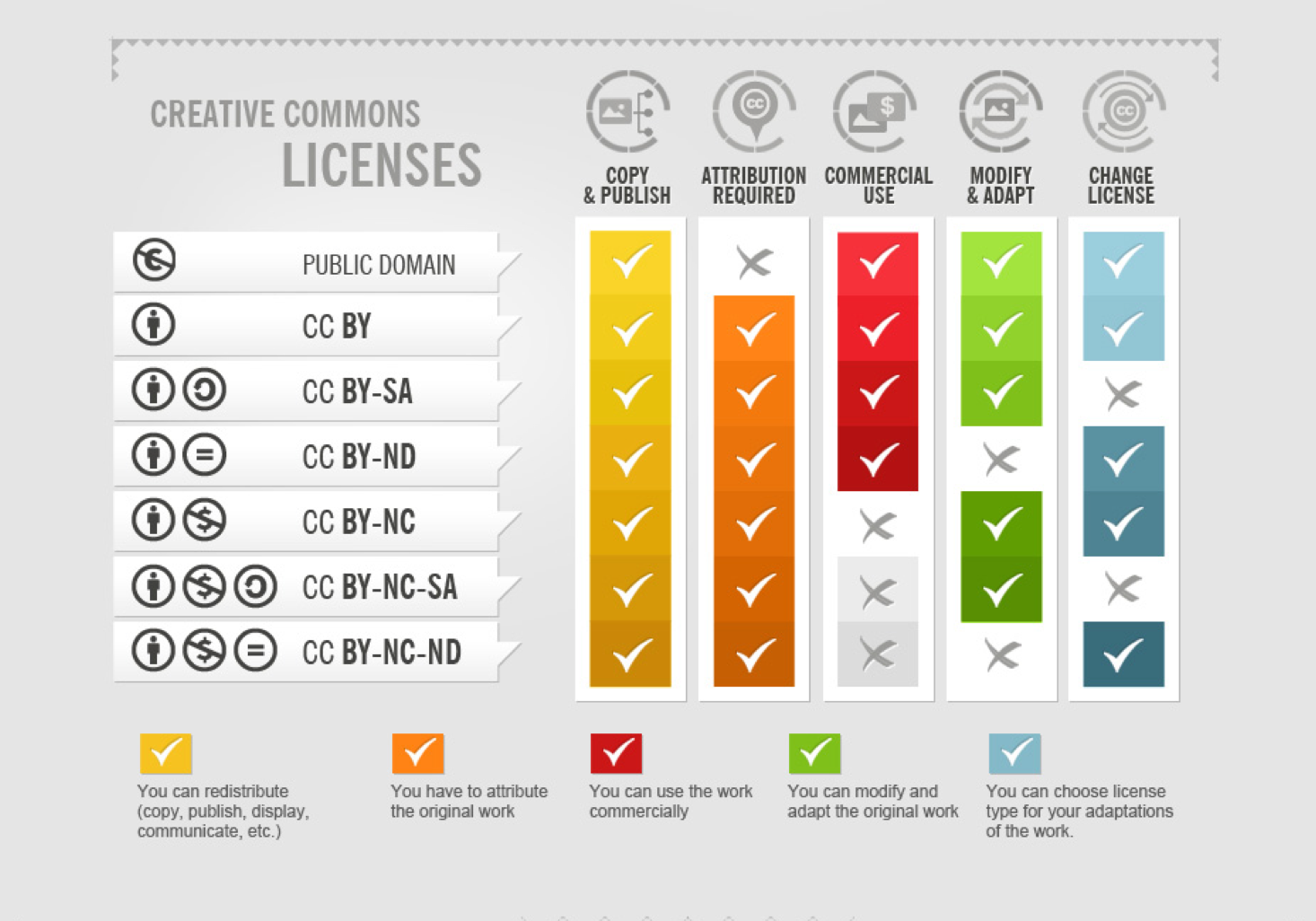
I find the format of this one easier to read and clearer, myself. The colour-coded checks under various columns let me know at a glance which licenses allow for commercial use, revision, etc., and which don’t. I also like the brief explanation of each column that follows the chart.
The only thing that’s confusing, though I’m glad they included it, is the row for copyright. There are two problems with this:
- The original creator retains copyright in their works when using any CC license. One doesn’t give up copyright.
- Everything depends on what permissions the original creator allows for use of the work when asked. The things that are “x” under each column may actually be allowed by the author/creator. It’s just that you have to ask permission first.
- The row for “copyright” is under the title “Creative Commons Licenses,” which suggest that there is some CC license called “copyright.”
So I find the “copyright” row problematic. But I’m glad they included the “public domain” row, which many charts leave out. It’s just that they suggest that it’s only for those works whose copyright has expired or forfeited. It doesn’t let people know that they can choose to use CC0, the Creative Commons Public Domain Mark.
Finally, there is a comprehensive infographic on CC licenses by foter.com, here. It’s quite long and detailed, so I’ll just include a couple of screen shots here.
Part of How To Attribute Creative Commons Photos by Foter, licensed CC BY SA 3.0
This image is quite similar to that linked to from Xplore, above. It is of course fine if they based their graphic on the one from Foter (which was published earlier), except that since the one from Foter is licensed CC-BY-SA, then the one from Xplore should be licensed similarly (and the original should be attributed).
Be that as it may, this original from Foter doesn’t have the confusing bit about copyright, and doesn’t suggest that public domain is restricted to works whose copyright has expired, been forfeited, or is otherwise inapplicable.
It’s interesting how they order the licenses from most permissive (top) to least permissive (bottom) even though one might have considered putting the SA’s together and the ND’s together. It’s not that BY-ND is more permissive than BY-NC, though; or is it? That’s actually what this infographic suggests in another part:
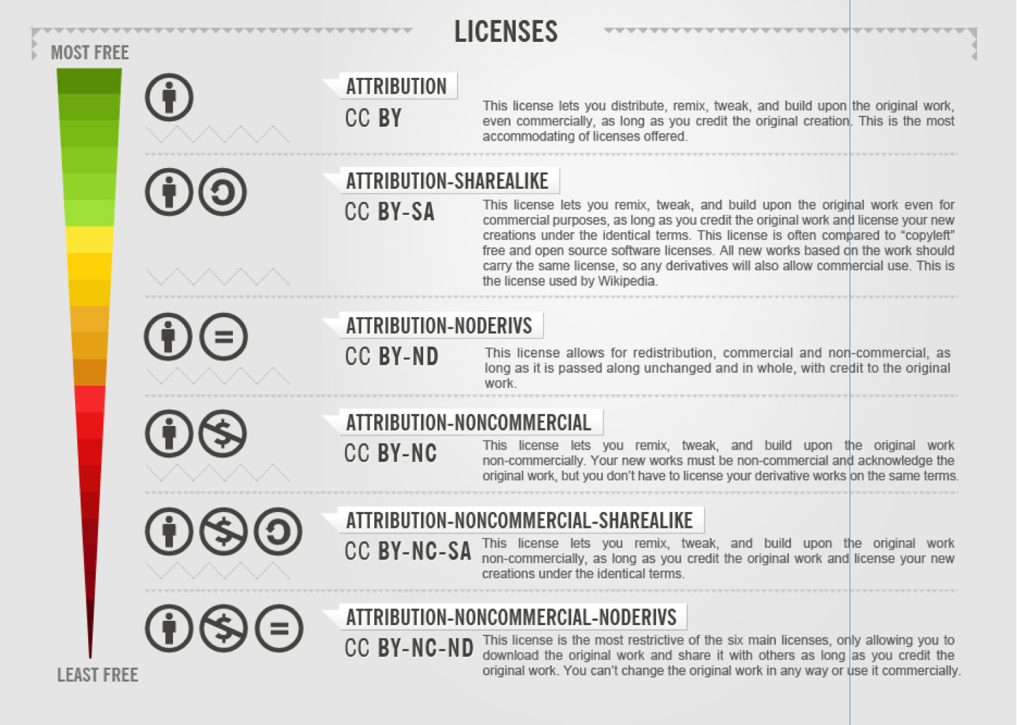
Part of How to attribute Creative Commons photos, by Foter, licensed CC-BY-SA 3.0
This suggests that there is a range from most to least permissive, with each license occupying a clear place in that step-wise range. I like the idea here of including the permissiveness/restrictiveness of the licenses in the graphic, but I think the particular order is not exactly clear. Why is ND more permissive than NC? I suppose it is, if one is emphasizing where/how the work may be used, but for OER at least, I think ND is more problematic than NC because to actually be useful in educational contexts one must be able to revise the work.
And of course, why not include CC0 in this list, which would be above CC-BY? I find that CC0 often gets left behind in discussions of CC licenses, with people thinking that the most permissive thing they can do is use CC-BY. But if one doesn’t particularly care about being attributed, then why not use CC0? Some may indeed care, and so then of course CC-BY is the right one to use.
I don’t have any big conclusions to draw from all this, except that I personally find the one from Foter the best in terms of presenting the information accurately, clearly and simply. I’d be curious to hear if others have different reactions!
 Follow