In this section, we provide recommendations to guide your inclusion of accessible, image-based content.
An excerpt from The Accessibility Toolkit by Amanda Coolidge and Josie Gray, BCcampus, Sue Doner, Camosun College, Tara Robertson, in the role as Accessibility Librarian at CAPER-BC at Langara College (she has moved from Langara College to Mozilla, where she’s the Diversity and Inclusion Strategic Partner)
What are images?
Images are non-text elements that include photographs, illustrations, diagrams, pictures, charts, graphs, and maps.
File types used: GIF, JPG, PNG
Why are you including the images you have selected?
Before you can determine what to do to make an image accessible, you must identify its purpose or value to your textbook. Consider the following questions:
- Does your image serve a functional purpose? In other words, is it conveying non-text content to students? If so, you should:
- Does your image serve more of a decorative purpose? In other words, is it primarily a design element that does not convey content? If so, you should:
- avoid unnecessary text descriptions
Who are you doing this for?
This work supports students who:
- Are blind or have low vision, like Jacob
- Have poor contrast vision
- Are colour blind and cannot differentiate between certain colours
- Use a device with monochrome display
- Use a print copy that is in black and white
- Have limited Internet access and cannot download images
- Have a form of cognitive disability

What do you need to do?
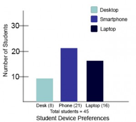
Determine the role of each image used in content as either functional or decorative. Once that has been decided, select how each image will meet accessibility needs by providing descriptive text in a variety of ways. Figures, such as charts and graphs that rely on colour to convey information, should also be evaluated for accessibility by students who are unable to distinguish between or see colour.
Decorative images
If an image does not add meaning, i.e., if it’s included for decorative or design purposes only, or if the image is adequately described in the caption and/or surrounding text, it doesn’t need an alt tag. Including alternative text descriptions for decorative images “simply slows the process down with no benefit because the screen-reading software vocalizes the content of the [alternative text description], whether that alternative text adds value or not.” [3] However, this doesn’t mean that you should leave an alt tag blank.
When a screen reader detects an image with a blank alt tag, it will read out the image file location. So when an image doesn’t require an alt tag, place a double-quotation mark (“) in the Alternative Text field; this step will prompt the screen reader to say “Graphic” and move on to the caption.
Using colour
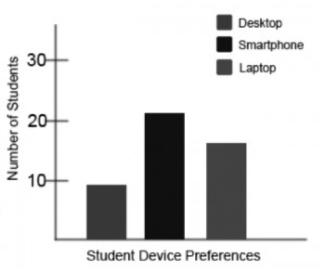
Would any necessary context or content be lost if the colour was “turned off”? Images should not rely on colour to convey information; if your point requires colour, you may need to edit or format the image so the concepts presented are not lost to those who are colour blind or require high contrast between colours.
Functional images
Consider what your content page would look like if the images didn’t load. Now try writing alternative text for each image that would work as a replacement and provide the same information as the image.
As you work on developing your alternative text descriptions, keep the following recommendations and guidelines in mind:
- Remember that alternative text must convey the content and functionality of an image, and is rarely a literal description of the image (e.g., “photo of cat”). Rather than providing what the image looks like, alternative text should convey the content of the image and what it does. [4]
- For relatively simple images (e.g., photographs, illustrations), try to keep your text descriptions short. You should aim to create a brief alternative (one or two short sentences) that is an accurate and concise equivalent to the information in the image.
- For more complex images (e.g., detailed charts, graphs, maps), you will need to provide more than a one- or two-sentence description to ensure all users will benefit from the content or context you intend to provide.
- Leave out unnecessary information. For example, you do not need to include information like “image of…” or “photo of…”; assistive technologies will automatically identify the material as an image, so including that detail in your alternative description is redundant.
- Avoid redundancy of content in your alternative description. Don’t repeat information that already appears in text adjacent to the image.
There are three ways to provide alternative text descriptions for images:
- Describe the image in the alt tag
- Describe the image in the surrounding text
- Create and link to a long description of the image
For more information on each of these methods and how to use them when working in Pressbooks, see the Images chapter in the Accessibility Toolkit.
Citations:
[1] “Web Content Accessibility Guidelines (WCAG) 2.0: Guideline 1.1,” W3C, accessed March 27, 2018, http://www.w3.org/TR/WCAG20/#text-equiv.
[2] “Web Content Accessibility Guidelines (WCAG) 2.0: Guideline 1.4.1,” W3C, accessed March 27, 2018, http://www.w3.org/TR/WCAG20/#visual-audio-contrast.
[3] “Top 10 Tips for Making Your Website Accessible,” UC Berkeley: Web Access, accessed March 27, 2018, https://webaccess.berkeley.edu/resources/tips/web-accessibility#accessible-alt.
[4] “Alt text blunders,” WebAIM, accessed March 27, 2018, http://webaim.org/articles/gonewild/#alttext.