By Karolina Karas, strategist, Marketing and Communications at BCcampus
My online accessibility journey began a little over a year ago when I stumbled on a font the Government of British Columbia created to help residents access written digital materials more comfortably. (It’s called BC Sans, if you’re curious!)
Since then, and inspired by the core values at BCcampus, I have spent many hours reflecting and implementing changes big and small to our online communication strategies at BCcampus, specifically materials created for our social media channels and webpages.
Many of the concepts I have worked on over the past year are not exclusive to those working in marketing and communications. If you have a platform online or are communicating in any way with a large audience online, I hope these tips are transferable to you.
Use Plain Language
Plain language is writing designed so that the reader can quickly, easily, and completely understand the content. You can implement a number of techniques to use plain language, including:
- Using active voice, not passive voice
- Avoiding jargon and acronyms
- Writing shorter sentences and paragraphs
- Using common, everyday words
- Designing documents with lists, headers, and tables as needed
Word choice is also important in writing. A number of inclusive language guidelines are available online. Good places to start are here and here.
Add Image Descriptions
Alternative (alt) text conveys meaning and provides context for images, infographics, graphs, and other media. Blind and low-vision users rely on alt text to provide meaning to media on digital mediums like webpages or social media platforms.
- Be concise! Detail is important, but for most mediums, sources recommend your alt text be the length of a tweet.
- Think about which detail is helpful for your audience and context. How you would describe a picture of books for content about a book sale versus content about a semester reading list would have different details in the alt text.
- Skip writing “image of,” “photograph of,” “picture of,” or anything similar. Screen readers already know they are announcing an image.
- If text is included in the image and is central to the meaning, transcribe it.
- Use humour when appropriate.
- Do you love to tweet a good GIF? In January 2020, Twitter added alt text for GIFs!
- Use a screen reader to read your alt text out loud. This can help you hear the details from the user’s perspective.
Be Mindful of Imagery
Here are some best practices for the design elements of images you post.
- Strive to have good colour contrast on images you post online. WCAG 2.1 AA compliance is a contrast ratio of 4.5:1 between foreground and background colours when you use regular font and 3:1 with large font.
- A number of tools are available to test colour combinations, including this favourite of some staff at BCcampus.
- Avoid placing text on textured backgrounds or over images, unless the text is large and contrast is high.
Diversity in imagery is also an accessibility concern. BCcampus shared a blog post with a list of stock photo websites focused on diversity, equity, and inclusion, and we update the list when we find a new resource. I use it so often, it’s one of my most visited bookmarks.
More Tips
I have a few more tips to help you make your online content a bit more accessible, but these don’t fit in any of the categories above.
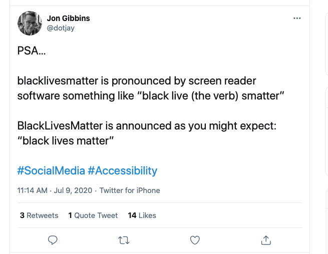
- When you use a multiword hashtag, capitalize each word. This is called CamelCase. It helps screen readers but also generally makes hashtags easier to read and decipher for all.

- If you post a video, make sure you add captions. It allows deaf individuals and those with hearing issues the opportunity to watch videos and allows all viewers to watch videos more comfortably in sound-sensitive environments.
- If you share a link on social media, use a link-shortening tool. Link-shortening services are key for accessibility because they limit the characters a screen reader has to read.
Keep Learning
My journey is ongoing, and there have been a few bumps along the way. If anything sticks with you from this post (and if you made it all the way down here, thank you!), I encourage you to try, ask questions, and learn from mistakes or progress you make. One commitment at BCcampus is to publicly share its electronic data interchange and accessibility strategies for digital communications. It is by no means a perfect document, but a living and breathing one we intend to update regularly as we continue to listen, learn, and do. Making the internet a more equitable space is an ongoing project and requires commitment, so I encourage you to keep learning alongside us.
View the Social Media EDI and Accessibility Practices [PDF].
