The ApplyBC Modernization project provides a major update to our 10-year-old application service, providing exceptional user experience for students wishing to apply at one or more of B.C.’s educational institutions.
To provide our partner institutions with a consistent marketing message for students applying online, we have built useful design elements into the next iteration of the ApplyBC online application. The applications will continue to be completed via ApplyBC.ca, and our goal is to make this experience seamless for the applicants while providing additional value to the institutions.
Institution Specific Experience
Using ApplyBC, applicants create a unique profile that enables them to apply at the institution of their choice while saving their personal and academic history, making it easier to apply to additional institutions if required. The previous version of the ApplyBC application collected information in two parts.
- The common form data was used to collect the academic history and personal information of the applicant. This information is common to all institutions, and makes the application process faster for students wishing to apply at multiple institutions. The common form pages were very generic, with a single spot for an institute’s logo or banner providing the only differentiation.
- Once the common form was completed, the applicant was taken to the next section (for institutions using our full service application), or were transferred to the institution’s own website to continue the application.
The upgraded version of the ApplyBC application allows each institution to brand each page of the application, including the common form information. A custom banner, designed by the institution, can be placed at the top of each page, and the copy can be tailored to provide a consistent message. Overall, this provides a more cohesive experience for the applicant while providing the necessary data for the institution.
Integrated Graphics
The current ApplyBC online application has a section for each institution to add their corporate logo, but that’s the extent of the current branding opportunities. The new application has been tailored to closely resemble the current marketing efforts of the institution, providing an opportunity to adjust the colors, copy, and some design elements.
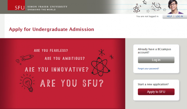
Simon Fraser University was the first institution to migrate to the new platform. The online application we created for them includes many elements of their current branding. The messaging and color scheme represent the institution accurately, and fit into the design outline of their existing website.
SFU-branded ApplyBC landing page
SFU website banner (students.sfu.ca)
Some institutions may not be able to provide us with branding information. In that case, a generic default page will be used. This generic page will still be able to collect all of the relevant information for the institution, but will not have any institution-specific details.
Personalized URL
In addition to the custom landing page, each institution will be able to choose a unique URL to share with their audience. All URLs will begin with applybc.ca, but institutions can choose to use a unique identifier that works with their branding efforts. For example, Simon Fraser University is well known as SFU, so they chose applybc.ca/sfu. In many cases, the applicant will follow a logical pathway from the target institution to the ApplyBC online application, but the new online form will closely resemble the institution’s website, so the applicant may not notice they’ve been transferred to our site. Once the application has been completed, the applicant is returned to the institution’s website to explore the other options available.
We’re very excited to see the new forms roll out for each institution, and we look forward to launching them soon.
Posted by BCcampus Editorial Staff


