Organizing content so it has a logical flow just makes sense. Using chapters, headings, and sub-headings to organize a resource allows students to clearly see how the main concepts are related. In addition, headings are one of the main ways that students using a screen reader navigate through a chapter.
An excerpt from The Accessibility Toolkit by Amanda Coolidge and Josie Gray, BCcampus, Sue Doner, Camosun College, Tara Robertson, in the role as Accessibility Librarian at CAPER-BC at Langara College (she has moved from Langara College to Mozilla, where she’s the Diversity and Inclusion Strategic Partner)

Who are you doing this for?
Everyone benefits from having content that’s clearly organized. Well-organized content supports students who:
- Have a learning disability, like Ann
- Are blind or have low vision, like Jacob
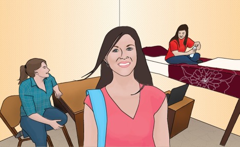
Image Caption: Ann has a learning disability that makes it difficult for her to concentrate. Well organized content and clear headings make it easy for her to go back and find the important points.
Image Attribution: Original artwork by Hilda Anggraeni (BCcampus). CC-BY.
Image Alt text: Ann
Image caption: Jacob is blind. Headings give him more control in navigating through the chapter. He can skip to the relevant section, instead of having to read the whole thing in a linear fashion.
Image attribution: “WFE003: Jacob” by Rosenfeld Media. CC-BY.
Image alt text: Jacob
Why is this important?
Headings help to identify the hierarchical structure of a document (e.g., sections, sub-sections). They provide a visual cue that helps sighted readers quickly navigate through sections of a document, skimming until they find the section they are looking for. Similarly, headings create logical divisions in the content and allow a non-sighted user to navigate a page or document easily using a screen reader.
When it comes to using visual references to indicate the hierarchy and structure of a document, you might be accustomed to changing the font style, enlarging the type size, or highlighting the text with bold, underline or italics to create the impression of a heading. This approach presents problems when creating material with accessibility in mind because screen readers won’t identify the text as a heading. Instead, the screen reader will just “read” through the text of a heading as if it were regular content, missing your intended cues about structure and organization.
What do you need to do?
In Pressbooks, use the visual editor to tag sections with Heading 1, sub-sections with Heading 2, sub-sections of sub-sections with Heading 3, and so on.
Image caption: Heading options in Pressbooks’ visual editor.
Image alt text: A drop-down menu showing a list of heading options in Pressbooks
Join us for an upcoming event:
-
Oct. 1 – Nov. 2, 2018 – Facilitating Learning Online (FLO) – Fundamentals
-
Oct. 9, 2018 – Pressbooks Training Webinar – Intro + Intermediate 3
-
Oct. 24, 2018 – Symposium 2018: Scholarly Teaching & Learning in Post-Secondary Education
-
Oct. 29 – Nov. 2, 2018 – Facilitating Learning Online (FLO) – MicroCourse: Experience and design a community building activity
-
Nov. 2, 2018 – Fall ETUG 2018
-
Nov. 7 – 8, 2018 – Liberating Structures Workshop 2018
-
Nov. 26 – 30, 2018 – FLO MicroCourse: Write your teaching philosophy statement
-
Apr. 17 – 18, 2019 – Save the date: Cascadia Open Education Summit
To stay informed with BCcampus by signing up for our newsletter, visiting our calendar and following @BCcampus on Twitter.
